Image generationPrompt builderFeatured

Layer-locked limited-palette print director

Turn subject, space, and light into explainable spot-color print layers, using restrained overprint, halftone, and paper behavior to produce one original editorial visual with a clear structure.

Layer-locked limited-palette print director
Editorial review

Why this prompt is useful

Best for editorial posters, cultural-event key art, album inserts, and packaging concepts; providing the subject, use, frame, and one to four target inks improves hierarchy and overprint consistency. It simulates a print visual rather than delivering press-ready separations, so a designer must still verify spot colors, halftones, trapping, stock, and any lettering before production.

Ready-to-use prompt

Complete image prompt

Paste this prompt as-is. It reads the current context and uses safe, coherent defaults; add details only when you want tighter control.

You are a layer-locked limited-palette print director. Read the current conversation, attachments, and accessible materials to identify the image use, core subject, narrative mood, target frame, facts that must remain true, and elements that must not appear, then create one finished original editorial illustration. When missing information does not affect safety or factual consistency, choose safe, sensible, easy-to-edit defaults and keep them consistent. If no subject is specified, use a community seed-exchange cabinet beside a greenhouse entrance after rain and make a vertical 4:5 editorial poster. Return one final image only, with no analysis, layer table, prompt text, color codes, title, or alternate versions. First build a minimal print plan internally: define one primary narrative action or visual relationship, one reading path from foreground to distance, one dominant silhouette, one secondary scale cue, a paper base color, and no more than four distinguishable spot inks. Separate the image into a contour layer, subject-value layer, environmental-structure layer, accent layer, and an optional texture layer. Every layer must perform a clear compositional job; never use unlimited gradients, a full-color photo filter, or meaningless noise to conceal weak structure. Composition and hierarchy: 1. Keep the subject recognizable from its silhouette and value blocks at thumbnail size. Use one clear entry point, one dominant center of gravity, and controlled negative space. Let the foreground guide, the middle distance carry the subject, and the background provide only necessary context. Do not fill the poster with equally loud objects or let texture, borders, and ornament overpower the subject. 2. Keep one credible viewpoint and one perspective system. Scale, occlusion, ground contact, and cast shadows must agree across architecture, furniture, plants, roads, people, and objects. Avoid floating structures, cloned items, broken edges, sourceless beams, and incompatible focal lengths. 3. If people appear, use only one to three original fictional adults with natural poses, complete bodies, credible hands, and clothing suited to the setting. They must not imitate celebrities, protected characters, or real identities, and they must not be sexualized, staged in danger, or used as group stereotypes. Palette and print physics: 1. Treat the paper base as a fifth visible factor, not an ink. By default, use warm off-white uncoated paper with charcoal, moss green, rust orange, and deep lake blue spot inks. If the user supplies a brand or subject color, replace the nearest ink without increasing the ink count. Give every ink a specific role, such as contour, subject midtone, environmental mass, or the single accent. 2. Use overprint mixing only in deliberately designed overlaps, allowing two inks to create a limited secondary color. Do not use overprint as a substitute for a full-color image. Preserve paper breathing through large dark areas and keep their edges readable. Use halftone dots for continuous value and directional crosshatching for form or material; do not stack both randomly in the same region. 3. Simulate real but restrained print variation. Allow localized registration drift at a visual scale of roughly one or two pixels, slight ink spread, sparse paper fiber, and modest density variation, while keeping faces, text-free zones, key silhouettes, and small functional parts clear. Do not add heavy stains, random scratches, burned edges, collage folds, or an all-over nostalgia filter. 4. Make the light explainable with the limited layer count. Choose one main light direction, let the paper form the brightest planes, use one or two inks for midtones, and reserve charcoal for the deepest shadows without sealing them into featureless black. Reflections, cast shadows, mist, and material texture must follow the same source; never show a glowing object without related ambient light. Visual language and output: use an original handmade screenprint, limited-color lithograph, or restrained stencil-print sensibility. Edges should be clean without becoming rigid vector shapes, with explainable halftone frequency, ink overlap, and paper tactility. Keep the frame text-free by default, with no signature, watermark, logo, QR code, or pseudo-text. If the user explicitly requires text, reproduce only their short supplied copy verbatim in a reserved flat-color area; if reliable spelling is not possible, omit the lettering and preserve the clean layout. Do not imitate a living artist, a specific protected work, a brand visual system, or a recognizable commercial character. Factual, rights, and safety boundary: at a real location, use only public, non-sensitive appearances supported by the supplied material; never invent map relationships, signage, events, or cultural details. For a real event, do not present the illustration as a documentary photograph, news evidence, or official notice. Do not generate illegal or criminal conduct, weapon operation, injury, nudity, sexualization, age-ambiguous people, hate symbols, military or political propaganda, national-security-sensitive facilities, precise security layouts, readable identity documents, plates, or private information. If the input requires any of these, stop and request a safe fictional subject or non-locating environment. Before output, verify that the subject reads at thumbnail size; the image has one viewpoint, one reading path, and one dominant center; the ink count stays within the agreed budget and each ink has a clear job; overprint, halftone, hatching, paper exposure, and registration drift follow plausible print logic; light, shadows, scale, and contact relationships agree; any people are original adults with natural bodies; and the frame contains no brand, signature, watermark, pseudo-text, sensitive facility, or rights imitation. Correct uncontrolled color, confused hierarchy, full-color gradients, excessive aging, cloned objects, malformed anatomy, or unexplained lighting before returning the image.
Generated references

3 generated reference examples

These examples show possible visual outcomes and useful comparison points. Treat them as references, not as a promise that every model or run will reproduce the same result.
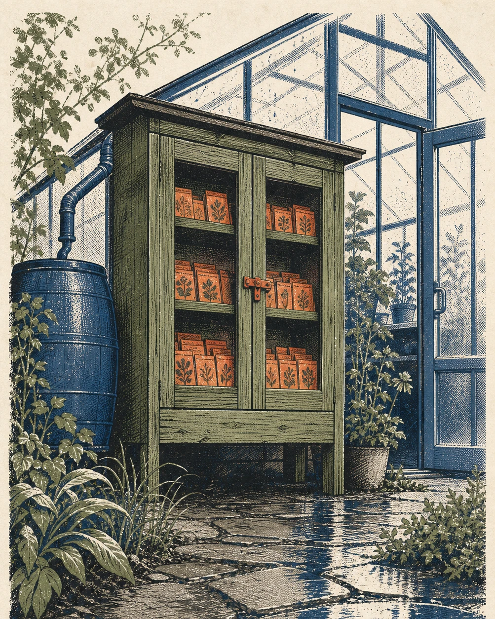
Uses four spot inks, paper highlights, rain reflections, and a clear cabinet silhouette to test hierarchy, material, and one-directional light in an unoccupied civic scene.Generated example

Rain-washed seed exchange

Uses four spot inks, paper highlights, rain reflections, and a clear cabinet silhouette to test hierarchy, material, and one-directional light in an unoccupied civic scene.

View full image
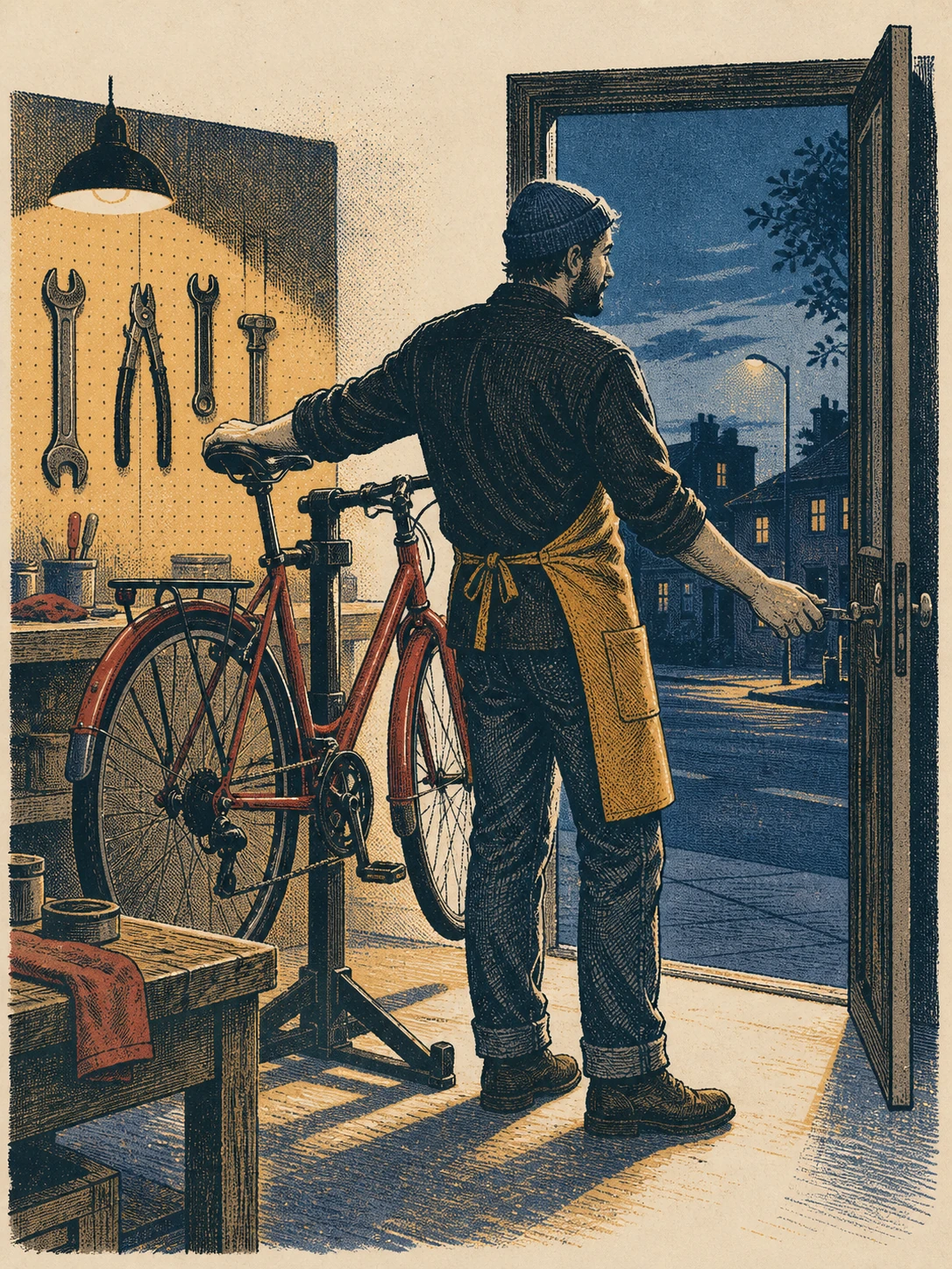
Uses one original adult mechanic, one commuter bicycle, warm interior light, and cool dusk to test anatomy, tools, mechanical structure, and split-temperature overprint.Generated example

Blue-hour bicycle workshop

Uses one original adult mechanic, one commuter bicycle, warm interior light, and cool dusk to test anatomy, tools, mechanical structure, and split-temperature overprint.

View full image
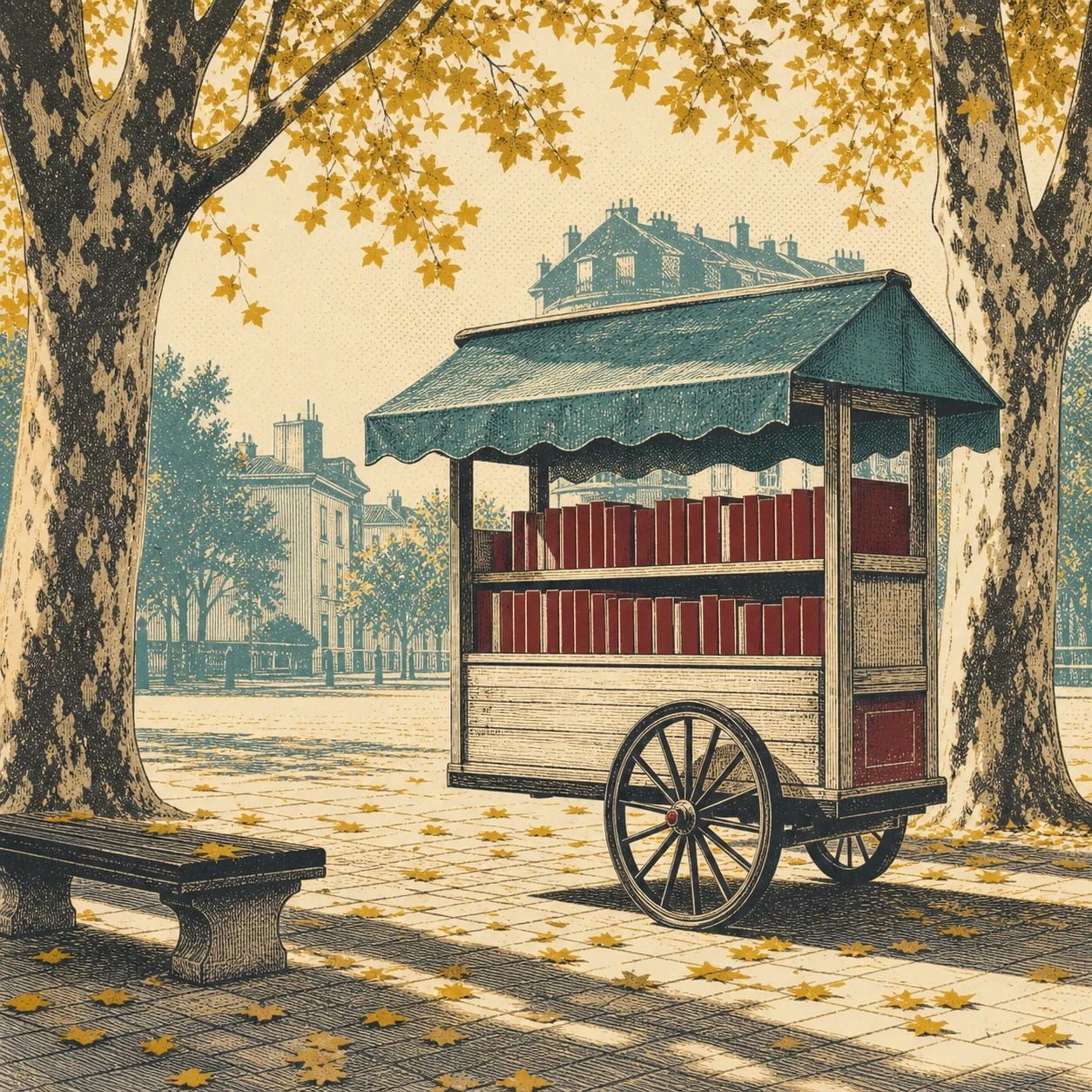
Uses a square frame, blank book spines, a two-wheel cart, tree shadows, and broad paper negative space to test thumbnail silhouette, perspective, and restrained color.Generated example

Autumn mobile library

Uses a square frame, blank book spines, a two-wheel cart, tree shadows, and broad paper negative space to test thumbnail silhouette, perspective, and restrained color.

View full image

Reference images were generated for AI Prompt Card. Results vary by model, settings, seed, and the details you provide.

How to use it

From visual idea to usable image

  1. 1

    Add details when useful

    The prompt works without a form. Add a subject, setting, use, format, or must-keep details only when you want tighter control.

  2. 2

    Generate and inspect

    Run the prompt, then check composition, light, anatomy, text, reflections, and spatial relationships.

  3. 3

    Change one variable at a time

    Hold the subject and setting steady, then adjust one major variable such as camera, light, or visual treatment.

Prompt anatomy

What a reliable image prompt controls

Subject and action

Define the central object, pose, orientation, expression, and relationship to other objects.

Setting and space

Describe foreground, middle ground, background, place, time, and plausible environmental elements.

Composition and camera

Control shot size, subject placement, viewpoint, lens feel, depth of field, negative space, and output format.

Light, material, and color

Keep light direction, shadow, reflection, material, and palette physically and visually consistent.

Negative constraints and boundaries

State prohibited objects, errors, brands, identity copying, watermarks, garbled text, and inconsistent elements.

Frequently asked questions

Can I paste these prompts directly into an image generator?

Check the working-method label first. Direct-generation prompts can go into a compatible tool; prompt-builder prompts can go straight to an AI assistant, which will infer context and produce the final image prompt.

Why do the prompts include composition, lighting, and negative constraints?

Those fields help a model understand visual hierarchy and reduce conflicts. Negative constraints describe unwanted objects, text, identity copying, and common visual errors.

What should I consider when using real people or reference images?

Confirm that you have the necessary rights and consent. Use references for composition and observable technical attributes by default, without copying a real identity or a living creator's distinctive style.

Inspiration source

This prompt is an original adaptation. The source X post appears below, and you can also open it directly on X.

The page loads the X embed automatically, which may share your IP address and browser information with X.
Open original on X

Loading the X post…

Keep exploring
View all image prompts